Post List Element
Last Update: October 8, 2026
The Avada Post List Element is a simple, yet powerful element that allows you to display a list of posts from any post type. It can be used in any number of ways, limited only by your imagination. You can display posts, pages, portfolio items, faqs, products, Avada Slides; indeed any registered post type on your site.
Read on to find out more about this element, and watch the video below for a visual overview.
How To Use The Post List Element
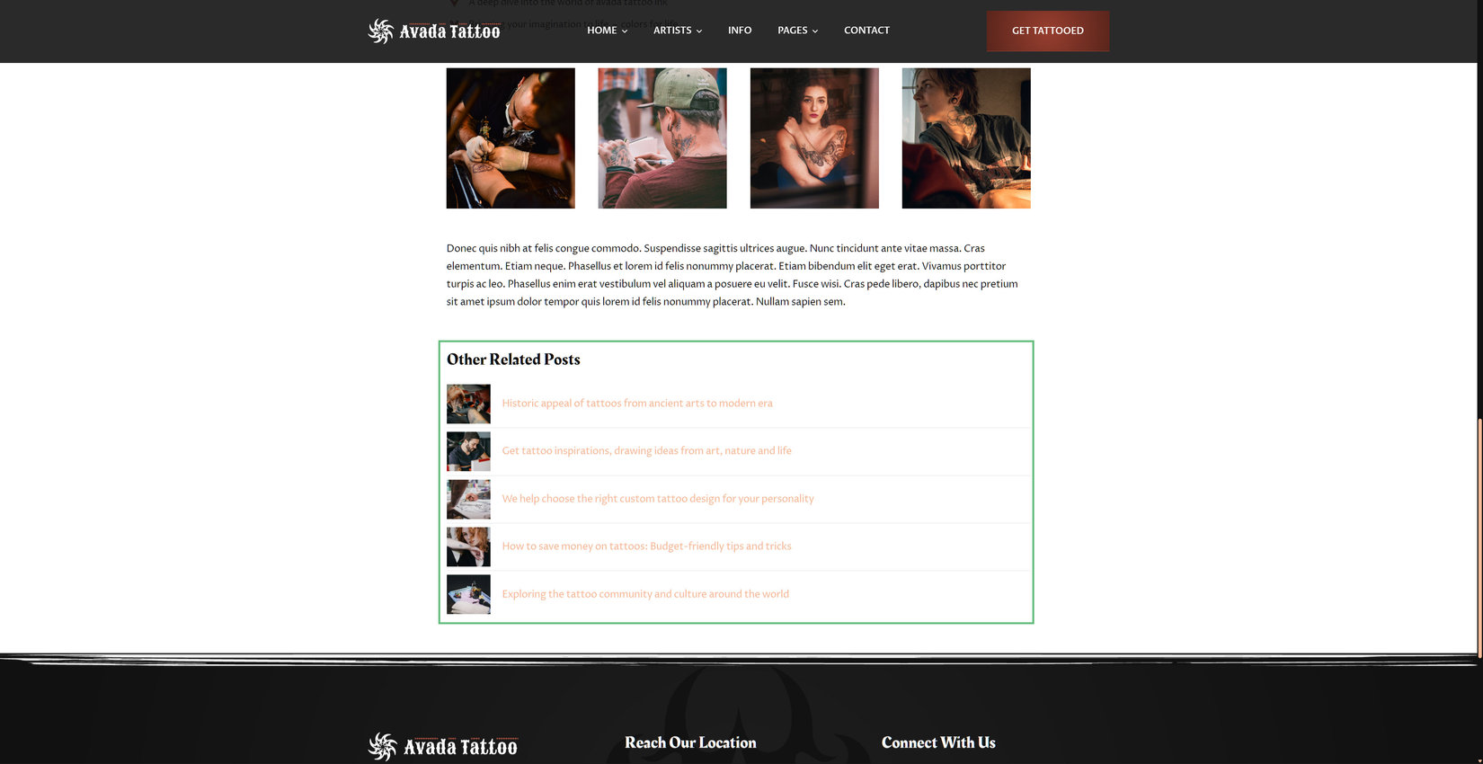
Just add the Element into a page or layout section, and configure it to display what you want. You can choose the post type to display, you can also filter the post list by categories, tags, or any other taxonomy, you can include or exclude any term, you can order them as you like, and you have full control over the styling on the Design tab. The example of the element below displays the blog posts other than the current one.
Element Options
Note: Please note that the displayed option screens below show ALL the available options for the element. If you have Avada’s Option Network Dependencies turned on, you will only see options relevant to your selections, and so the options screen may look somewhat different.
General
| Heading | Description | |
|---|---|---|
| Post Type | Select the post type to pull the entries from. | |
| Posts To Display | Choose which posts should be pulled in. "Related To Current" uses the terms of the post or archive being viewed and falls back to the latest posts elsewhere, the builder preview included. The two child options only apply to hierarchical post types such as pages, and fall back to the top level when there is no parent to go by. | |
| Related By | Choose the taxonomy that decides which posts count as related. "Automatic" uses the main taxonomy of the post type, which is the categories where there are any. | |
| Parent Page | Select the post whose children should be displayed. | |
| Filter By | Choose a taxonomy to narrow the posts down by. The fields to pick the terms appear once one is chosen. | |
| Include Categories | Select the categories to pull posts from. Leave empty for all. | |
| Exclude Categories | Select the categories whose posts should not be displayed. | |
| Include Tags | Select the tags to pull posts from. Leave empty for all. | |
| Exclude Tags | Select the tags whose posts should not be displayed. | |
| Include Brands | Select the brands to pull posts from. Leave empty for all. | |
| Exclude Brands | Select the brands whose posts should not be displayed. | |
| Include Product Categories | Select the product categories to pull posts from. Leave empty for all. | |
| Exclude Product Categories | Select the product categories whose posts should not be displayed. | |
| Include Product Tags | Select the product tags to pull posts from. Leave empty for all. | |
| Exclude Product Tags | Select the product tags whose posts should not be displayed. | |
| Include Portfolio Categories | Select the portfolio categories to pull posts from. Leave empty for all. | |
| Exclude Portfolio Categories | Select the portfolio categories whose posts should not be displayed. | |
| Include Portfolio Skills | Select the portfolio skills to pull posts from. Leave empty for all. | |
| Exclude Portfolio Skills | Select the portfolio skills whose posts should not be displayed. | |
| Include Portfolio Tags | Select the portfolio tags to pull posts from. Leave empty for all. | |
| Exclude Portfolio Tags | Select the portfolio tags whose posts should not be displayed. | |
| Include FAQ Categories | Select the faq categories to pull posts from. Leave empty for all. | |
| Exclude FAQ Categories | Select the faq categories whose posts should not be displayed. | |
| Include Element Type | Select the element type to pull posts from. Leave empty for all. | |
| Exclude Element Type | Select the element type whose posts should not be displayed. | |
| Include Category | Select the category to pull posts from. Leave empty for all. | |
| Exclude Category | Select the category whose posts should not be displayed. | |
| Include Avada Sliders | Select the avada sliders to pull posts from. Leave empty for all. | |
| Exclude Avada Sliders | Select the avada sliders whose posts should not be displayed. | |
| Exclude Current Post | Choose to leave the post being viewed out of the list. | |
| Ignore Sticky Posts | Choose to treat sticky posts like any other, instead of pulling them to the top of the list. | |
| Order By | Defines how the posts should be ordered. "Post Views" needs the post views counter to be turned on in Global Options > Extras, and only lists posts that have been viewed at least once. | |
| Custom Field Name | Insert the name of the custom field to order by. Posts without that field are not listed. | |
| Custom Field Type | Select the value type of the custom field, so it is sorted correctly. | |
| Order | Defines the sorting order of the posts. | |
| Number Of Posts | Set the maximum number of top level posts to display. Set to 0 to display all. | |
| Offset | Set the number of posts to skip before the list starts. | |
| Display Type | Select how the posts should be displayed. The select navigates to the selected post. | |
| Collapse To Select On | Choose to replace the list with a select on smaller screens. This keeps long lists usable on mobile. Both are output and swapped at the breakpoint, so the posts are in the markup twice. | |
| Select Label | The text of the first, empty select option. Leave empty for the default. | |
| Layout | Choose a stacked list or an inline, wrapping row of posts. The inline layout is always flat. | |
| Nest Child Posts | Choose to display child posts nested below their parent. Only applies to hierarchical post types such as pages, and is ignored for the others. Not available for the inline layout. | |
| Child Posts Display | Choose how nested child posts behave. "Current Branch Only" shows the children of the post being viewed, "Accordion" adds a toggle to each parent. | |
| Maximum Depth | Set the maximum number of levels to display. Set to 0 for unlimited. | |
| Icon | Select the icon that should be displayed in front of every post title. Leave empty for no icon. | |
| Show Featured Image | Choose to display the featured image of each post. The image is displayed after the icon, so both can be used together. | |
| Hover Image Preview | Choose to show the featured image of a post next to the cursor while the post is hovered. Works independently of the featured image in the list, and only on devices with a mouse. | |
| Meta Elements | Choose which meta items each post shows, and the order they are shown in. Views needs the post views counter to be turned on in Global Options > Extras. | |
| Meta Position | Choose to place the meta on its own line below the post title, or on the same line as the title. On the same line it follows the item content alignment. | |
| Meta Start | Choose where the meta line starts. It can begin at the edge of the row, or line up under the post title so it stays clear of a leading icon or image. | |
| Date Format | Set a custom date format, ex: F j, Y. Leave empty to use the format set in the Global Options, which falls back to the WordPress setting. | |
| Meta Separator | The text placed between the meta parts. Leave empty for the default. | |
| Show "All" Item | Choose to add an item that links to the archive of the post type. | |
| "All" Item Text | The text of the "All" item. Leave empty for the default. | |
| Highlight Current Post | Choose to highlight the post of the page being viewed, as well as its parents. | |
| Element Visibility | Choose to show or hide the element on small, medium or large screens. You can choose more than one at a time. | |
| Element Sticky Visibility | Choose to show or hide the element, based on the current mode (normal or sticky) of its parent container. You can choose more than one at a time. | |
| CSS Class | Add a class to the wrapping HTML element. | |
| CSS ID | Add an ID to the wrapping HTML element. |
Design
| Heading | Description | |
|---|---|---|
| Element Max Width | Set a maximum width for the element, so that it does not have to span the full width of its column. Leave empty to use the full width. Enter value including any valid CSS unit, ex: 300px. | |
| Margin | Enter values including any valid CSS unit, ex: 4%. | |
| Inline Alignment | Choose how the posts align within the column. | |
| Item Content Alignment | Select the content alignment within each post item. "Space Between" pushes the meta to the far side. It has no effect on a meta line placed below the title, which always spans the row. | |
| Accordion Toggle Position | Choose if the accordion toggle is pinned to the end of the post item, or if it follows the post content and is aligned together with it. | |
| Item Spacing | Set the space between the post items. In the stacked layout the space is split evenly above and below each item, so a separator line ends up centered within it. Enter value including any valid CSS unit, ex: 10px. | |
| Item Padding | Set the padding inside each post item. Enter values including any valid CSS unit, ex: 10px. | |
| Item Border Style | Select the style of the border around each post item. | |
| Item Border Size | Set the border size of each post item. The border follows the child post settings, so it is indented with the inset indent style and frames the whole block when child posts are grouped. It is independent of the separator. Enter values including any valid CSS unit, ex: 1px. | |
| Item Border Radius | Set the border radius of the post item background. Enter values including any valid CSS unit, ex: 4px. | |
| Child Posts Indent | Set the indentation of each nested level, in pixels. | |
| Child Posts Indent Style | Choose if the indentation also insets the item background and separator, or if those keep spanning the full width. | |
| Group Child Posts | Choose to visually group child posts with their parent post. When enabled, the item spacing and the separators are only used between the top level posts, so a parent and its open child posts read as one connected block. The item border radius is applied to that block instead of each single item. Works best combined with an item background color and the full width indent style. | |
| Separator Size | Set the thickness of the separator, in pixels. | |
| Separator Style | Select the style of the separator between the post items. | |
| Separator Color | Controls the color of the separator between the post items. | |
| Post Title Typography | Controls the typography of the post titles. Leave empty for the global font family. | |
| Meta Typography | Controls the typography of the post meta. Leave empty to inherit the post title typography. | |
| Icon Size | Set the size of the icon. Enter value including any valid CSS unit, ex: 16px. Leave empty to inherit the post title font size. | |
| Featured Image Width | Set the width of the featured image, in pixels. | |
| Featured Image Border Radius | Set the border radius of the featured image, in pixels. | |
| Media Spacing | Set the space between the icon, the image and the post title, in pixels. | |
| Hover Preview Width | Set the width of the hover image preview, in pixels. The height follows the image. | |
| Hover Preview Border Radius | Set the border radius of the hover image preview, in pixels. | |
| Colors | ||
| Post Title Color | Controls the text color of the post titles. Leave empty to inherit the global link color. | |
| Post Background Color | Controls the background color of each post item. | |
| Post Border Color | Controls the border color of each post item. Leave empty to inherit the global separator color. | |
| Meta Color | Controls the color of the post meta. Leave empty to inherit the post title color. | |
| Icon Color | Controls the color of the icon. Leave empty to inherit the post title color. | |
| Accordion Toggle Color | Controls the color of the accordion toggle icon. Leave empty to inherit the post title color. | |
| Select Text Color | Controls the text color of the closed select field. The list of options that opens on click is drawn by the browser and can not be styled. | |
| Select Background Color | Controls the background color of the closed select field. The list of options that opens on click is drawn by the browser and can not be styled. | |
| Select Border Color | Controls the border color of the select field. | |
| Select Focus Border Color | Controls the border color of the select field on hover and while it is focused. | |
| Select Border Radius | Set the border radius of the select, in pixels. | |
| Select Height | Set the height of the select field. Enter value including any valid CSS unit, ex: 40px. |
Extras
| Heading | Description | |
|---|---|---|
| Conditional Rendering | Add conditional rendering logic for the element. The element will only be part of the post / page contents, if the set conditions are met. NOTE: Server cache can interfere with results. | |
| Animation Type | Select the type of animation to use on the element. | |
| Direction of Animation | Select the incoming direction for the animation. | |
| Animation Color | Select the color of the animation | |
| Speed of Animation | Type in speed of animation in seconds (0.1 - 5). | |
| Animation Delay | Select the delay time after the animation starts(0 - 5). | |
| Offset of Animation | Controls when the animation should start. |